Checkboxes and Radios
Overview
Grial has a very flexible Checkbox control to increase the Xamarin.Forms out-of-the-box set of basic controls. It can be easily styled and use from Xaml. Grial also has support for Radio button-like interactions.
Checkbox Properties
| Name | Type | Description |
|---|---|---|
| IsChecked | bool | Represents the state of the Checkbox (Checked/Unchecked). Default value is false. |
| CheckedBackgroundColor | Color | The color used for the background color when the Checkbox is checked. |
| UncheckedBackgroundColor | Color | The color used for the background color when the Checkbox is unchecked. |
| CheckedBorderColor | Color | The color used for the border color when the Checkbox is checked. |
| UncheckedBorderColor | Color | The color used for the border color when the Checkbox is unchecked. |
| IconColor | Color | The color used for the icon displayed within the Checkbox. |
| IconFontSize | double | The size of the icon displayed within the Checkbox. |
| ControlTemplate | ControlTemplate | Control template that is used to display the Checkbox content. |
Checkbox Events
| Name | Type | Description |
|---|---|---|
| IsCheckedChanged | Event | Fired when the Checkbox checked state changes. Args: IsCheckedChangedEventArgs { IsChecked: bool } |
Samples
By default, Grial provides a ControlTemplate for a Checkbox.
It can be found inside App.xaml.
The Checkbox template expects two template parts with specific x:Name: Checked and Unchecked. The control is responsible to always display the correct one at runtime.
It also uses a ContentPresenter to display user-defined content, e.g.: a Label showing descriptive text.
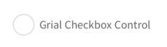
Let's see how to use the it and how the default template looks like:
<grial:Checkbox>
    <Label Text="Grial Checkbox Control" />
</grial:Checkbox>
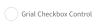
The control is rendered initially as unchecked because the IsChecked defaults to false.
It it were true, or after the first tap it looks like this:

Let's change the appearance of our Checkbox by setting different colors:
<grial:Checkbox
    IsChecked="true"
    CheckedBorderColor="Orange"
    CheckedBackgroundColor="Orange"
>
    <Label Text="Grial Checkbox Control" />
</grial:Checkbox>

Now let's make the icon size bigger by adding the following:
IconFontSize="20"

Let's see a more advanced scenario: making the Label to display a different color once the control is checked, and make that happen without changing the default ControlTemplate for the Checkbox.
The final result will look like this:
Unchecked state
Checked state

We will need to add a few things to our original Checkbox instance to accomplish this:
- An identifier for our
Checkbox. - A
DataTriggeron theLabelthat reacts toIsCheckedchanges.
Let's take a look at the final code:
<grial:Checkbox
    IsChecked="true"
    CheckedBackgroundColor="Purple"
    x:Name="checkbox"
>
    <Label Text="Grial Checkbox Control">
        <Label.Triggers>
            <DataTrigger TargetType="Label" Binding="{ Binding IsChecked, Source={x:Reference checkbox} }" Value="true">
                <Setter Property="TextColor" Value="{ Binding CheckedBackgroundColor, Source={x:Reference checkbox} }"/>
            </DataTrigger>
        </Label.Triggers>
    </Label>
</grial:Checkbox>
About radios
The Radio buttons provided with Grial are a composition of the Checkboxs.
They let the user select one option from a set of mutually exclusive set.
This is done by taking advantage of the selection capabilities of the Repeater control.
Let's see an example:
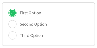
<!-- THE REPEATER CONTROL WILL LOOP OVER DATA AND RENDER ALL RADIOS -->
<grial:Repeater
    Orientation="Vertical"
    SelectionMode="Single"
    Spacing="10"
>
    <grial:Repeater.ItemsSource>
        <x:Array Type="{ x:Type x:String }">
            <x:String>First Option</x:String>
            <x:String>Second Option</x:String>
            <x:String>Third Option</x:String>
        </x:Array>
    </grial:Repeater.ItemsSource>

    <!--DEFAULT STATE-->
    <grial:Repeater.ItemTemplate>
        <DataTemplate>
            <grial:Checkbox IsChecked="false">
                <Label Text="{ Binding . }" Margin="4,0" />
            </grial:Checkbox>
        </DataTemplate>
    </grial:Repeater.ItemTemplate>

    <!--CHECKED STATE-->
    <grial:Repeater.SelectedItemTemplate>
        <DataTemplate>
            <grial:Checkbox IsChecked="true" InputTransparent="true">
                <Label Text="{ Binding . }" Margin="4,0" />
            </grial:Checkbox>
        </DataTemplate>
    </grial:Repeater.SelectedItemTemplate>

</grial:Repeater>